Case study
Designing and building a wellbeing learning platform for the modern workplace
Client
Confidential
Partnership
Dec 2025 - Mar 2026
Location
Australia
Industry
Education
Technology
Laravel, Amazon Web Services, PostgreSQL, Vue
Services
Product Design, Research & Development, Web Development, QA & Testing
About
Our client runs a corporate learning platform that helps organizations build psychological safety, wellbeing and leadership capability. Employees and leaders follow structured training modules, explore a content library, track their wellbeing and earn achievements. Organizations roll the platform out across their teams under their own brand colors.
We were brought in to take the product from audit to launch. We reviewed the existing platform, benchmarked it against LinkedIn Learning, Coursera and Udemy, and redesigned the full experience for desktop and mobile. Then we developed and shipped it: capability building, module and activity pages, the library, wellbeing tools, achievements, surveys and notifications.

Challenge
A Dated, Decoration-Heavy Interface. The existing platform felt calm but visibly outdated. Oversized illustrations pushed learning content below the fold, so the depth of the content was hidden behind decoration.
No Clear Path Through Learning. All modules had equal visual weight, the primary action didn’t stand out and progress looked secondary. Users couldn’t tell what was assigned, what was in progress or what to do next.
Seven Activity Types, Zero Consistency. Modules combine very different activities: interactive Applied Learning posts, automated Gratitude and Mindfulness tasks, redirects to articles and surveys, SCORM packages, quizzes and action plans. Each one risked becoming its own mini-interface.
A Library That Didn’t Scale. An overloaded sidebar competed with the content, cards and thumbnails were inconsistent, and a single dropdown filter couldn’t handle a growing library of articles, videos and audio.
One Product, Many Organizations. The platform is deployed by multiple employers, so the interface had to adapt to each client’s brand without breaking the visual system.
Solution
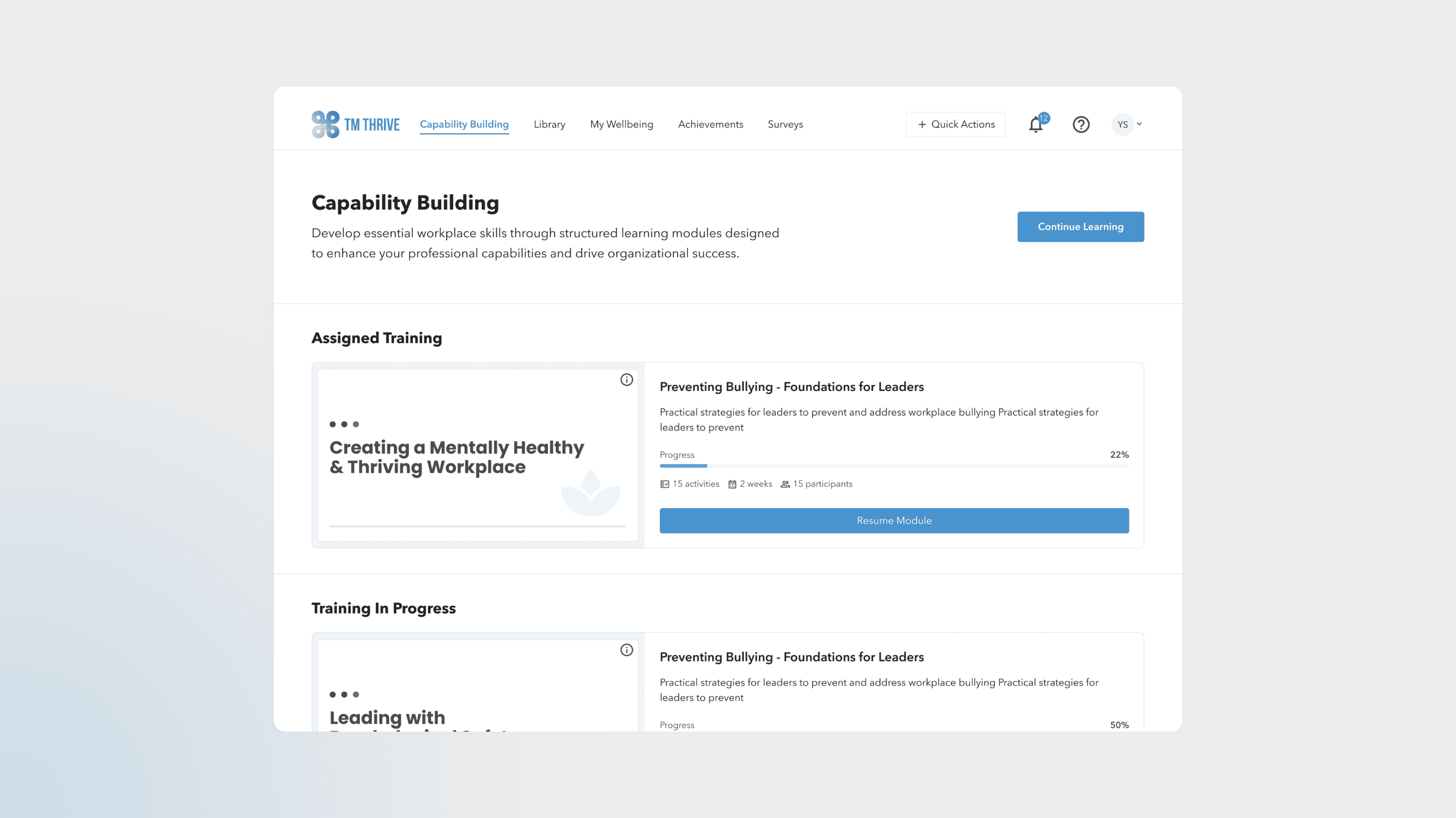
A Content-First Learning Hub. Training is grouped by status, with progress and one clear next action on every card, so users see straight away what to do and what to pick up next.
One Activity Framework. Seven very different activity types share a single structure, so every module reads as one predictable journey.
A Library Built for Discovery. A clean grid of unified cards, a dedicated filter panel and purpose-built pages for articles, videos and audio make the library easy to browse and scan.
Wellbeing in Every Flow. Gratitude, Mindfulness and professional support through AccessEAP are one click away from any page.
A White-Label System, From Design to Code. A shared component library with themeable client color palettes, full desktop and mobile layouts, and every empty, loading, error and success state were designed and then built into the production platform.
Learning journeys
Training is organized into Assigned, In Progress and Available modules, so users always know what’s required, what they’ve started and what to explore next. Each card shows progress, duration and a single clear action: Start, Resume or Review. Inside a module, learning outcomes, a scannable activity list and time remaining keep the path to completion visible at every step.

One activity framework
Applied Learning posts, automated wellbeing tasks, library and survey redirects, SCORM packages, quizzes and action plans all share one structure: tag, title, overview and supporting resources. Only the interactive part changes with the type. A progress sidebar previews what’s coming next, so even very different activities feel like one continuous journey.

Everyday wellbeing
Gratitude and Mindfulness practices sit in My Wellbeing and are one click away from any page through Quick Actions. A Support & Feedback modal connects users directly to AccessEAP for professional help, so wellbeing is part of the daily routine rather than a separate section.

Achievements
Every completed module and activity turns into something users can see and keep. Badges celebrate milestones along the way, and certifications confirm finished training with a clear record of what was completed and when. Progress stops being a percentage on a card and becomes a collection users are motivated to grow.

Result
In just four months, from December 2025 to March 2026, the product went from audit to a fully developed, production-ready platform.
From Audit to Launch in Four Months. UX review, redesign and full-stack development were delivered in one continuous cycle. Design and engineering worked side by side, so approved screens moved straight into development without long handoffs, and the client saw working features within weeks rather than months.
A Complete Product, Built and Shipped. Around 80 desktop and mobile screens were designed and implemented end to end: capability building, module pages, seven activity types, the library, wellbeing tools, achievements, surveys, notifications and profile. Every empty, loading, error and success state is covered.
Engineered to Grow. A shared component library and one activity framework mean new activity types, content and features can be added without rebuilding pages from scratch. Themeable client color palettes let each organization launch under its own brand on a single codebase.
Guided Learning. Clear progress, prominent next steps and wellbeing tools one click away turned a static content catalog into a guided experience that helps employees build skills and look after themselves at work.