Case study
Building a social ranking app with swipe voting, head-to-head battles, and ELO-based rankings
Client
Elorate
Partnership
Apr 2025 - Aug 2026
Location
Poland
Industry
Entertainment
Technology
React Native, Expo
Services
Mobile Development
About
Elorate is a social ranking app where the community decides what's best, from sneakers and street food to cars, cardigans and travel spots. Instead of star ratings and endless reviews, users rate "Elos" with a quick swipe or pick a winner in head-to-head matchups. Every choice feeds an ELO-based ranking system borrowed from competitive chess. Users collect their favorites into "Stacks," follow topics and creators, and watch rankings shift in real time. The goal is to turn opinions into a fast, playful habit and build rankings people actually trust.

Challenge
Elorate had a strong core idea: rankings shaped by real people, not algorithms or paid reviews. But the product needed a structure and an interface that made that idea feel effortless.
Voting Without Context. Simple upvotes and downvotes showed whether people liked something, but not how it compared to everything else, so rankings felt flat and easy to game.
Two Modes, One Habit. Quick swiping and head-to-head comparison had to live side by side without confusing users about which one to use, or when.
The Cold-Start Problem. New Elos had no votes and no visibility, so fresh content risked never entering the rankings at all. New users, in turn, had no personalized feed to come back to.
Content That Could Be Anything. A pizza, a supercar and a sweater all had to look great in the same card, list and detail layouts, while the UI stayed in the background and let the photos lead.
With a clear concept but a wide feature scope, Elorate needed a partner who could shape the product architecture and turn it into a consistent, buildable mobile experience.
Solution
We started by mapping the full information architecture (Rate, Discover, Create, Stacks and Profile) and defining how Elos, Stacks, hashtags and users connect to each other. From there, we designed a complete mobile UI built around one principle: every interaction should take seconds and leave a trace in the rankings.
Personalized Onboarding. A short intro to the core mechanics, followed by topic selection ("What are you into?"), so the feed and ranking queue are tailored from the very first session.
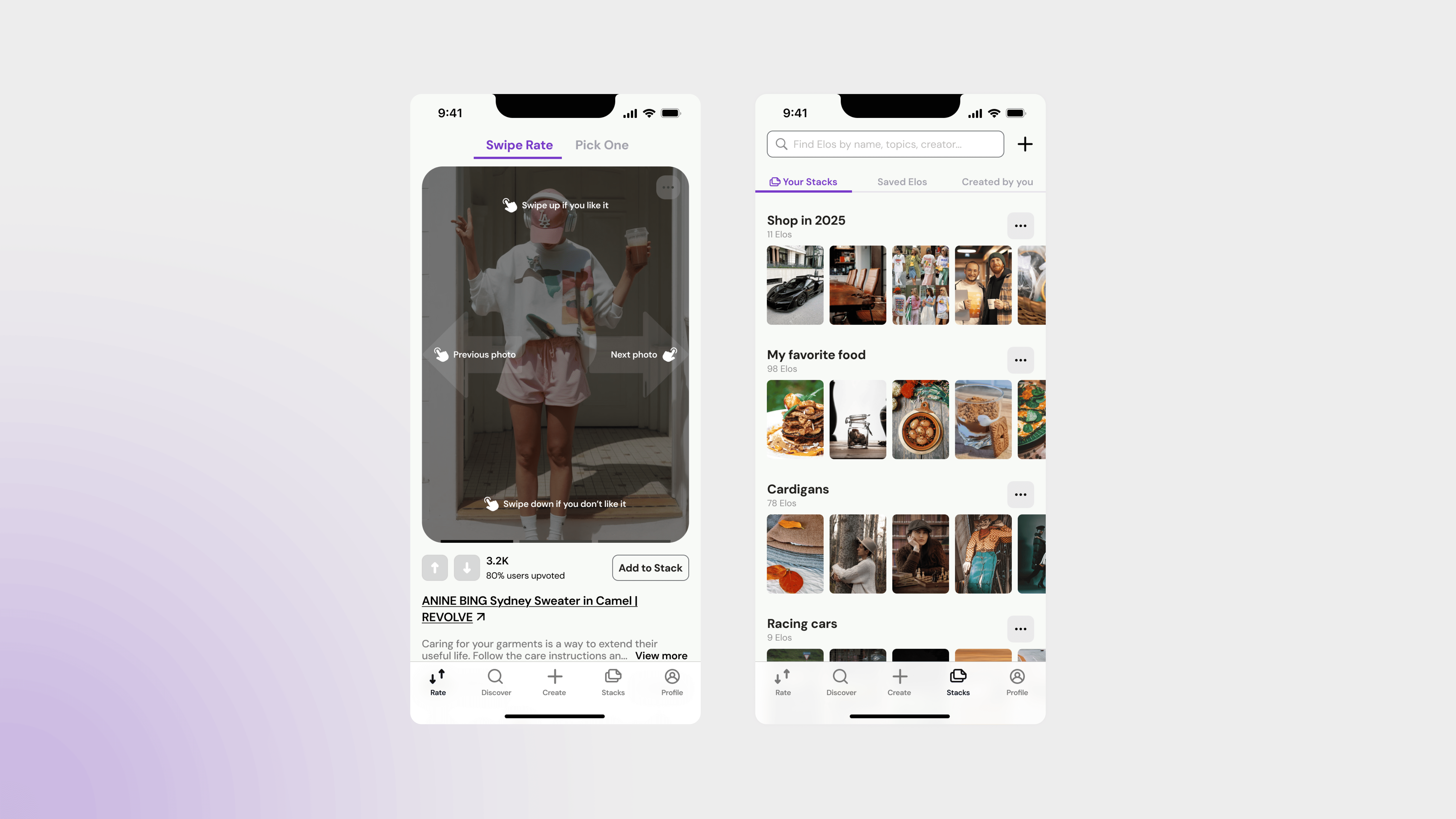
Swipe Rate. A Tinder-style card mode where users swipe up to upvote and down to pass, with a first-time instruction overlay and live stats showing how many users agreed.
Pick One. A split-screen comparison where the user chooses a winner and the ELO score updates instantly. This is the feature that turns casual opinions into meaningful rankings.
Smart Content Queue. New and unranked Elos are prioritized in the Rate flow and personalized by followed hashtags, so fresh content gets votes quickly and nothing stays invisible.
Stacks & Elo Pages. Personal collections with public or private visibility, plus detailed Elo pages with image carousels, global rank and rank changes, comments, and the Stacks each item appears in.
Discover, Create & Profile. Search across Elos, Stacks, users and hashtags, a streamlined creation flow, and a profile with followers, notifications and privacy settings rounded Elorate out into a complete social platform.
Swipe Rate
Two ways to vote, one ranking. Swipe through Elos one by one or choose a winner head-to-head. Every vote shapes the leaderboard.

Discover
Explore what the community is ranking. Search Elos, Stacks, creators and hashtags, and dive into the conversation behind every rating.

Stacks
Collect your favorite Elos into themed Stacks, from food and fashion to cars or anything else. Keep them private or share them with everyone.

Profile
Your taste in one place. Track your Elos, Stacks and ratings, tune the topics you follow, and stay on top of every vote, comment and new follower.

Result
The engagement turned a broad product concept into a complete, production-ready mobile experience, spanning onboarding, rating, discovery, collections and profile management.
End-to-End Coverage. Dozens of screens across sign-up, onboarding, Swipe Rate, Pick One, Discover, Create, Stacks and Profile, all in one consistent visual language.
Concept-to-Product Pipeline. Every core idea (head-to-head voting, ELO-based rankings, personalized content, shareable collections) was turned into a clear, buildable screen flow, ready for engineering handoff.
Content-First Interface. A clean, neutral UI with a single violet accent lets the photos lead, so a pizza, a supercar and a sweater all look at home in the same cards, Stacks and Elo pages.
Rating That Feels Like Play. Swipe Rate and Pick One turn a chore (leaving reviews) into a few seconds of fun, with instant feedback on how the community voted.
By combining clear product architecture with playful interaction design, we gave Elorate a product where every swipe counts, and rankings are shaped by real people, not algorithms.